Time Series Interpolation
How to interpolate and animate time series
This tutorial introduces the Time Series Analysis (TSA) submodule of the FORCE Higher Level Processing system (HLPS), shows how to interpolate time series, and how to visualize and animate them via QGIS plugins.
Info
This tutorial uses FORCE v. 3.7.6
Why interpolation?
Despite regular observations, EO time series are generally not equidistant. Nominal equidistance is only given for areas that are not covered by orbital overlaps (16 days revisit at nadir for a single Landsat). For areas in lateral overlaps, we have alternating revisits of 1 and 7 days. If we are getting closer to the poles, we even get triple, quadruple etc. overlaps, which complicates this alternating pattern. The same applies if we consider multiple sensors, e.g. two Landsat and two Sentinel-2 satellites. And of course, nominal revisit != actual revisit. We cannot see through clouds (unless we are talking radar). Probably, you want to remove snow observations. There might have been some sensor or ground segment outages, or the data couldn’t have been processed to our quality requirements (e.g. tier 2 data). The sensor might not have looked on Earth as the satellite took a detour to avoid space debris etc. etc..
Interpolation might simply be used to close these gaps. It smoothes the time series, and thus effectively reduces noise. Equidistance is established, which might be needed for following processing steps.
Time Series interpolation is a basic option within the Time Series Analysis submodule of the FORCE Higher Level Processing system (HLPS), and may be performed before using more advanced time series analysis methods:
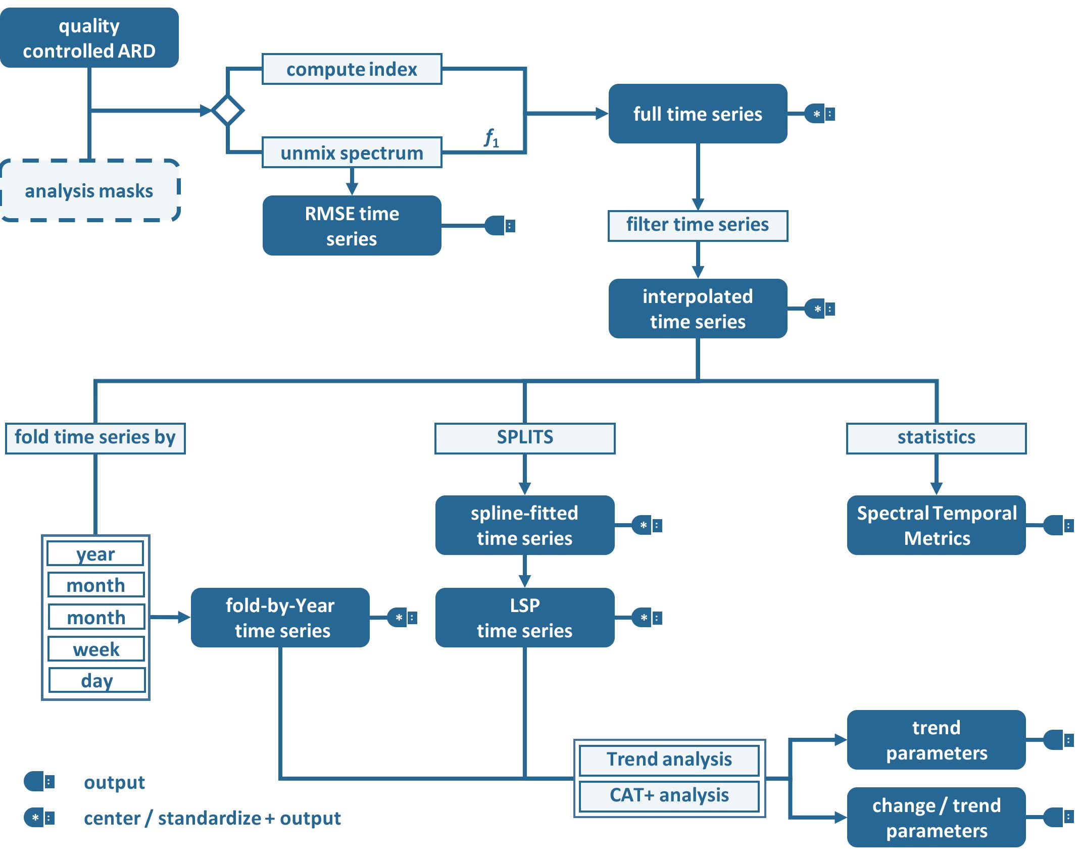
Time Series Analysis Workflow
RBF interpolation
In FORCE, a couple of interpolation methods are implemented.
Most often, we use ensembles of Radial Basis Function (RBF) convolution filters (see this paper). As this is a convolution filter, no fitting is involved (as e.g. compared to splines or Savitzky-Golay filters), thus the method is really fast, while keeping a good balance between retaining detail and smoothing.
The method is basically a moving average filter on steroids. A kernel is moved over the time series, and the observations are weighted according to a Gaussian distribution (Gaussian lowpass).
This means that an observation in the middle of the kernel gets a higher weight.
Now, data density is usually variable, which means that we have seasons with higher data availability (e.g. in the summer) - and seasons with poor data availability.
For good data situations, we would want to have a narrow Gaussian to more closely follow the actual time series.
For bad data situations, however, a narrow kernel would result in many nodata values and wouldn’t smooth the time series appropriately.
Therefore, we use multiple kernels of different widths.
The estimates from those kernels are eventually aggregated using a weighted average, wherein the weights correspond to the data availability within each kernel. This gives preference to the kernel with better data coverage.
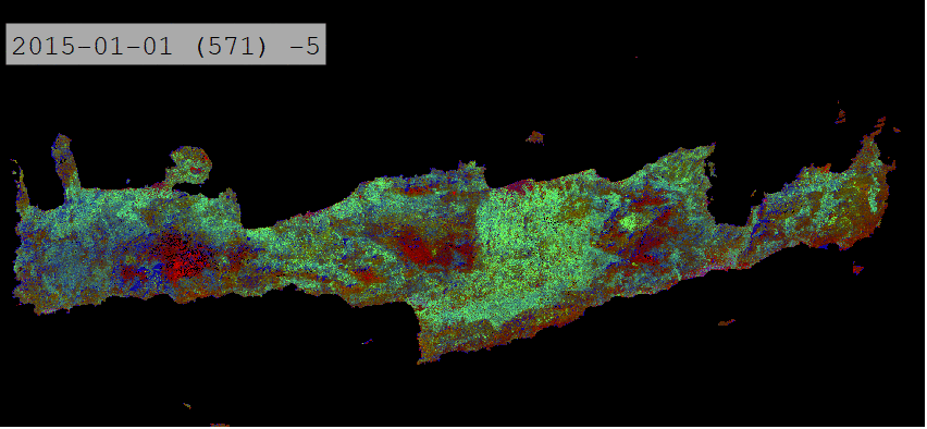
This tutorial will show you how to generate an RBF-interpolated time series, and how to dynamically look at the data. I will demonstrate this for the island of Crete (Greece) in the Mediterranean Sea. An interpolated time series looks like this:
Interpolated time series using RBF ensembles
Parameterfile
We start by generating an empty TSA parameterfile, and rename the file.
mkdir /data/europe/interpolation
force-parameter /data/europe/interpolation/tsi.prm TSA

$ An empty parameter file skeleton was written to
$ /data/europe/interpolation/tsi.prm
$ Note that all parameters need to be given, even though some may not be used
$ with your specific parameterization.
$ Parameterize according to your needs and run with
$ force-higher-level /data/europe/interpolation/tsi.prm
If you prefer a more compact parameterfile without all the comments, use the -c option.
The full set of parameters is also documented here: Parameterization.
Input / Output directories
For this tutorial, we assume that we already have an existing Level 2 ARD datapool, which contains preprocessed data for multiple years (see Level 2 ARD tutorial).
The parent directory of this datapool goes into the DIR_LOWER parameter.
The DIR_HIGHER parameter names the output directory, where the interpolated time series will be generated (although technically possible, I suggest to use a different file path).
Example:
DIR_LOWER = /data/europe/level2
DIR_HIGHER = /data/europe/interpolation
Analysis mask
As we are only interested in the land surface - and there is a lot of water around Crete - we use a processing mask. Have a look at the Processing Masks tutorial for further details.
mkdir -p /data/europe/masks
cp /data/europe/level2/datacube-definition.prj -t /data/europe/masks
force-cube -o /data/europe/mask -s 30 /data/gis/admin/crete.gpkg

$ 0...10...20...30...40...50...60...70...80...90...100 - done.
$ 0...10...20...30...40...50...60...70...80...90...100 - done.
$ 0...10...20...30...40...50...60...70...80...90...100 - done.
$ ...
In the parameterfile, use the masks like this:
DIR_MASK = /data/europe/masks
BASE_MASK = crete.tif
Output options
For interoperability with the QGIS plugins, we will generate one output image (for each index) in GeoTiff format, which will have the interpolated dates as bands:
OUTPUT_FORMAT = GTiff
OUTPUT_EXPLODE = FALSE
All other parameters are not relevant for now. However, please note that you can generate a lot of time series based outputs at the same time, e.g. Trend Analysis, Land Surface Phenology, etc. This saves time as data is only read once.
Spatial extent
FORCE HLPS requires a square processing extent, which can be set using X_TILE_RANGE and Y_TILE_RANGE.
Then, if the extent of our region of interest is not square, we can further refine the processing extent by specifying a tile allow-list (FILE_TILE).
Please see the The Datacube tutorial for more details, and I also suggest you to have a look at the Compute model of HLPS.
There are different ways to obtain these values, e.g. by generating, and filtering a shapefile with tiles via force-tabulate-grid.
The easiest way, however, is to use force-tile-extent with a vector geometry.
Example for Crete, Greece:
force-tile-extent \
   /data/gis/admin/crete.gpkg \
   /data/europe/level2 \
   /data/europe/interpolation/crete.txt

$ Suggested Processing extent:
$ X_TILE_RANGE = 103 111
$ Y_TILE_RANGE = 101 105
$
$ Processing extent is not square.
$ Suggest to use the tile allow-list:
$ FILE_TILE = /data/europe/interpolation/crete.txt
Block size
Tip
The block size is a parameter that you should only adjust if you are running in RAM-shortages. First, try the default value and don’t worry*
However, if the program is killed by the system, this can be mitigated by adjusting BLOCK_SIZE.
Please have a look at the Compute model to understand how blocks are implemented and used in FORCE.
The block size is a value, which was set in Level 2 Processing; thus the default block size aligns with the physical layout of the files, and can be considered optimal for reading speed. If you adjust it, it is recommended to use a block size, which is a fraction of the original block size (without remainder, e.g. 1/2 of the original value).
Quality screening
This here is super-important, and cannot be stressed enough!
Without proper quality screening, the results will look like s#%$, trash-in, trash-out! By default, FORCE screens for nodata values, various cloud types, cloud shadows, snow, sub-zero or saturated reflectance.
SCREEN_QAI = NODATA CLOUD_OPAQUE CLOUD_BUFFER CLOUD_CIRRUS CLOUD_SHADOW SNOW SUBZERO SATURATION
In addition, recognizing that cloud masks are never perfect, TSA offers an outlier detection routine. This screens each pixel’s time series and might be used to remove undetected cloud, cloud shadow, or snow remnants.
The outlier detection is iteratively removing outliers until the time series noise is smaller than the given value. Note however: this method might also remove some valid data points, e.g. mowing events in intensively managed grasslands. This risk increases with decreasing data availability.
Following the outlier removal, there is an inliner restoration. If an observation (flagged as cloud, cloud shadow etc.) fits well into the time series trajectory, it will be restored.
For our purpose, using this option is fine, thus, let’s keep the default values:
ABOVE_NOISE = 3
BELOW_NOISE = 1
Temporal extent, Sensor, Index
To eventually generate a long term animation, let’s use 30 years of Landsat data:
TIME_RANGE = 1990-01-01 2019-12-31
FORCE HLPS allows you to easily combine data from different sensors - provided that we only use mutually available bands.
For this tutorial, we are using data from the Landsat sensors:
SENSORS = LND04 LND05 LND07 LND08
RESOLUTION = 30
All processing in the TSA submodule is performed band-wise.
You can choose from a fairly long list of spectral bands and indices.
HLPS will only read required bands to reduce I/O.
In order to generate a nice-looking and information-rich animation, we are using the three tasseled cap components:
INDEX = TC-BRIGHT TC-GREEN TC-WET
Interpolation
Now, let’s define the interpolation parameters.
We wil be using the RBF interpolation to create a smoothed time series with 16-day interpolation steps.
INTERPOLATE = RBF
INT_DAY = 16
We are commonly using following widths for the gaussians. The width (in days) refers to full-width-at-half-maximum. This generally works fine, but feel free to experiment here.
RBF_SIGMA = 8 16 32
The cutoff parameter determines the width of the kernels.
It works similar to the confidence level in statistical tests, i.e. 0.95 means that we cut the kernel such that 95% of the Gaussian is retained.
Essentially, this paramter determines how many nodata values will remain in the time series.
You will have less nodata values with values closer to one.
However, the interpolated values will also be less reliable when the next valid observations are too far away (remember: trash-in, trash-out).
It also determines processing speed: more narrow kernels are faster.
Commonly, we are using the default value 0.95.
However, as our primary goal is to generate a nice-looking animation, we bump this parameter up:
RBF_CUTOFF = 0.995
..and of course, we request outputting the interpolated time series:
OUTPUT_TSI = TRUE
Parallelization
HLPS uses a computing model, which streams the data. Please have a detailed look the at the Compute model of HLPS.
Most often, generating interpolated time series (without doing anything else) is input-, or output-bound.
However, this strongly varies with data density, the number of requested indices, disc speed (SSD vs HDD, RAID or not, …), CPU clock speed, if you read/write from/to different (or the same) discs etc… The progress bar will tell you how much time is spent for reading, computing and writing.
This helps you identify if your job is e.g. input-limited. You might want to adjust the settings accordingly (also note that you may have more or less CPUs than me).
Please also note: fairly often, inexperienced users tend to overdo parallel reads/writes beyond a value that is reasonable - if reading/writing doesn’t accelerate when you add more CPUs, this is likely the case (you might even slow down your job by overdoing I/O).
NTHREAD_READ = 8
NTHREAD_COMPUTE = 7
NTHREAD_WRITE = 3
Processing
Processing is straightforward:
force-higher-level /data/europe/interpolation/tsi.prm


$ number of processing units: 280
$  (active tiles: 28, chunks per tile: 10)
$ ________________________________________
$ Progress:                        100.00%
$ Time for I/C/O:           054%/037%/008%
$ ETA:             00y 00m 00d 00h 00m 00s
$
$ ________________________________________
$ Real time:       00y 00m 00d 00h 58m 41s
$ Virtual time:    00y 00m 00d 01h 32m 54s
$ Saved time:      00y 00m 00d 00h 34m 13s
$
$ ________________________________________
$ Virtual I-time:  00y 00m 00d 00h 50m 30s
$ Virtual C-time:  00y 00m 00d 00h 34m 31s
$ Virtual O-time:  00y 00m 00d 00h 07m 53s
$
$ ________________________________________
$ I-bound time:    00y 00m 00d 00h 23m 42s
$ C-bound time:    00y 00m 00d 00h 07m 10s
$ O-bound time:    00y 00m 00d 00h 00m 26s
After this, we do some postprocessing for simplified data handling, and to prepare the data for ingestion into the QGIS plugins.
First, we generate a mosaic:
force-mosaic /data/europe/interpolation

$ mosaicking 3 products:
$ 1 1990-2019_001-365_HL_TSA_LNDLG_TCB_TSI.tif
$ 2 1990-2019_001-365_HL_TSA_LNDLG_TCG_TSI.tif
$ 3 1990-2019_001-365_HL_TSA_LNDLG_TCW_TSI.tif
$
$ mosaicking 1990-2019_001-365_HL_TSA_LNDLG_TCW_TSI.tif
$ 27 chips found.
$
$ mosaicking 1990-2019_001-365_HL_TSA_LNDLG_TCB_TSI.tif
$ 27 chips found.
$
$ mosaicking 1990-2019_001-365_HL_TSA_LNDLG_TCG_TSI.tif
$ 27 chips found.
Then, we build a four-dimensional stack from the three tasseled cap components. This stack is sorted by date, but interleaved by thematic band. This data model is a prerequisite to the usage of the following QGIS plugins.
Note
For very long time series, force-stack still seems a bit slow - but at least it works…
cd mosaic
force-stack *TCB*TSI.vrt *TCG*TSI.vrt *TCW*TSI.vrt 4D-Tasseled-Cap-TSI.vrt

$ file 1:
$   /data/europe/interpolation/mosaic
$   1990-2019_001-365_HL_TSA_LNDLG_TCB_TSI.vrt
$   9000 4000 684
$ file 2:
$   /data/europe/interpolation/mosaic
$   1990-2019_001-365_HL_TSA_LNDLG_TCG_TSI.vrt
$   9000 4000 684
$ file 3:
$   /data/europe/interpolation/mosaic
$   1990-2019_001-365_HL_TSA_LNDLG_TCW_TSI.vrt
$   9000 4000 684
$
$ Same number of bands detected. Stacking by band.
$
$ Band 0001: 1990-2019_001-365_HL_TSA_LNDLG_TCB_TSI.vrt band 1
$ Band 0002: 1990-2019_001-365_HL_TSA_LNDLG_TCG_TSI.vrt band 1
$ Band 0003: 1990-2019_001-365_HL_TSA_LNDLG_TCW_TSI.vrt band 1
$ Band 0004: 1990-2019_001-365_HL_TSA_LNDLG_TCB_TSI.vrt band 2
$ Band 0005: 1990-2019_001-365_HL_TSA_LNDLG_TCG_TSI.vrt band 2
$ Band 0006: 1990-2019_001-365_HL_TSA_LNDLG_TCW_TSI.vrt band 2
$ Band 0007: 1990-2019_001-365_HL_TSA_LNDLG_TCB_TSI.vrt band 3
$ Band 0008: 1990-2019_001-365_HL_TSA_LNDLG_TCG_TSI.vrt band 3
$ Band 0009: 1990-2019_001-365_HL_TSA_LNDLG_TCW_TSI.vrt band 3
$ ...
$ Band 2050: 1990-2019_001-365_HL_TSA_LNDLG_TCB_TSI.vrt band 684
$ Band 2051: 1990-2019_001-365_HL_TSA_LNDLG_TCG_TSI.vrt band 684
$ Band 2052: 1990-2019_001-365_HL_TSA_LNDLG_TCW_TSI.vrt band 684
For rapid display, we compute pyramids:
force-pyramid 4D-Tasseled-Cap-TSI.vrt

$ computing pyramids for 4D-Tasseled-Cap-TSI.vrt
$ 0...10...20...30...40...50...60...70...80...90...100 - done.
Visualization
Layer Styling
Let’s drag’n’drop the 4D-Tasseled-Cap-TSI.vrt into QGIS, and visualize the Tasseled Cap components of the 1st timestamp as RGB composite (using the Multiband color renderer), i.e. we put the first three bands into the red (Brightness), green (Greenness), and blue (Wetness) channels for intuitive color interpretation.
The chosen stretch will later be applied to the animation as well.
Time Series Plots
You can conveniently look at the pixels’s time series using the Raster Data Plotting plugin (© Andreas Rabe). I am using red, green, and blue lines for the Brigthness, Greenness, and Wetness components, respectively, and decrease the symbol size a bit.
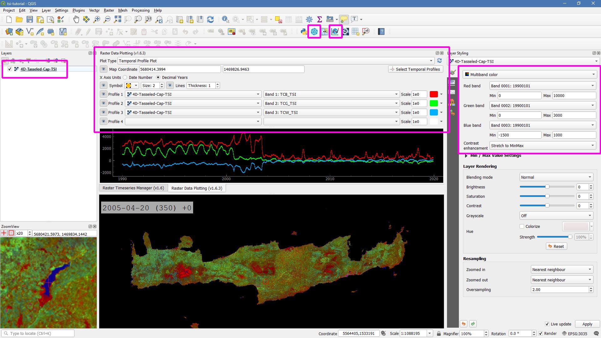
Raster Data Plotting plugin
Time Series Animation
Let’s use the Raster Timeseries Manager plugin (© Andreas Rabe) to generate a web- or presentation-ready animation.
One-time setup
For preparing the animation, go to the plugin’s System tab.
This needs to be done only once and will set up all necessary tools for saving the animation.
For this, you need to install ImageMagick, and then tell the plugin where the imagemagick and ffmpeg executables are located.
Simply select 4D-Tasseled-Cap-TSI in the Timeseries field.
Now, you can already look at the animation (hit play >).
While the animation is running, you can even pan and zoom in the map canvas.
IMHO, this is a great way of virtually exploring 4D data!
In the temporal tab, you can set the temporal range for the animation.
For the animation shown below, I only use the last 5 years of data (otherwise the GIF will be too large).
For saving the animation, go to the Video Creator tab, and set an output directory.
The export process takes two steps:
Export the frames as images. This is done by pushing the movie tape button.
Note
The size of the exported images depends on the size of the map canvas. This will have a direct effect on the size of the final animation. Adjust the canvas size to your needs.
Generate the animation by pushing the
MP4orGIFbutton.
Animation of interpolated Tasseled Cap time series
That’s it. Have fun exploring your 4D data.
|
This tutorial was written by David Frantz, main developer of FORCE, postdoc at EOL. Views are his own. |
EO, ARD, Data Science, Open Science |
|